Exploring Twenty Twenty-Four: A WordPress Theme for Any Website
Every year, the WordPress Community, led by the Automatic theme team, releases a new default theme showcasing the features of the latest WordPress version.
This was the case in November 2023 when WordPress 6.4 came with Twenty Twenty-Four, which many felt was the best default theme ever released by the team.
As with all recent default WordPress themes, Twenty Twenty-Four is a block theme that provides the ability to create every element of a website with blocks.
Twenty Twenty-Four lets you make a wide variety of websites, limited only by your imagination. However, its strength is in creating three types of sites, which I will explore in detail later on.
Let’s have a look at what makes Twenty Twenty-Four special.
Patterns
A WordPress pattern is a curated collection of logically oriented blocks that suggest the page layout. Any element in a pattern can be changed without any coding. Therefore, these patterns provide an easy way to begin your design process, ensure consistency, and speed up your workflow.
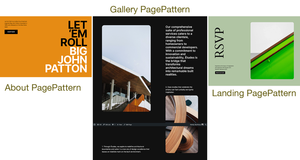
Twenty Twenty-Four comes packed with more patterns than any other previously released default theme. They include full and partial page patterns, like:
The theme’s 37 patterns are organized into these categories:
- About
- Banner
- Call to Action
- Featured
- Footer
- Gallery
- Pages
- Portfolio
- Posts
- Services
- Team
- Testimonials
- Text
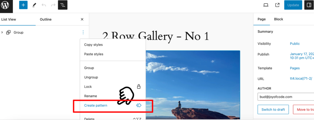
As with any WordPress theme, you can create custom patterns that can be used anywhere on your site.
Style Variations
The theme has eight style variations, which are sets of pre-defined styles that you can modify to suit your needs.
When you change the styling for your site, use any one of the variations that best match how you’d like your site to appear. Then, customize the color, typography, and similar settings as you like.
Fonts
No matter which style variation you choose, you will find the following fonts waiting for you by default:
Cardo
Cardo is a font that represents a bridge between traditional and modern typefaces. It has a solid, time-honored, and scholarly appearance.
Main Features
- Serif design
- OpenType
- Extended character set
- Historical inspiration
- Open source
Because of these properties, Cardo is ideal for use as web page headings for all devices.
Inter
The Inter font was specifically designed to be highly legible and visually pleasing on both desktop and mobile devices, making it an excellent choice for web design.
Main Features
- Multiple weights and styles
- Versatility
- Modern design
- Localization-friendly
This sans serif font is ideal for paragraphs, lists, links, or any type of body copy.
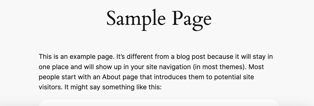
In the above example, “Sample Page” is set to Cardo with the body copy using Inter.
System Sans Serif and System Serif
You also have the option to set your fonts to either a system default sans serif or serif font. Which font is used will depend upon the user’s operating system. For example, many Apple devices use Roboto as the default sans-serif font.
What about using fonts not included in Twenty Twenty-Four? You can still bring in other fonts into your WordPress projects, such as Google Fonts or Adobe Fonts.
By late March 2024, with the release of WordPress 6.5, selecting fonts from the WordPress Font Library will be as easy as choosing an image from the Media Library.
Setting Fonts
As has been the case since the adoption of the Gutenberg block system, fonts can be set across the entire site or on a per-block basis.
Global Fonts
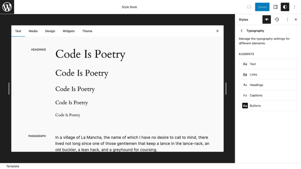
The Style Book, part of the Design section within the Site Editor, provides an ideal way to change your font selections from the pre-set selections found within every Style Variation.
Fonts for Text, Links, Headings, Captions, and Buttons are set using these choices in the right sidebar.
Per Block
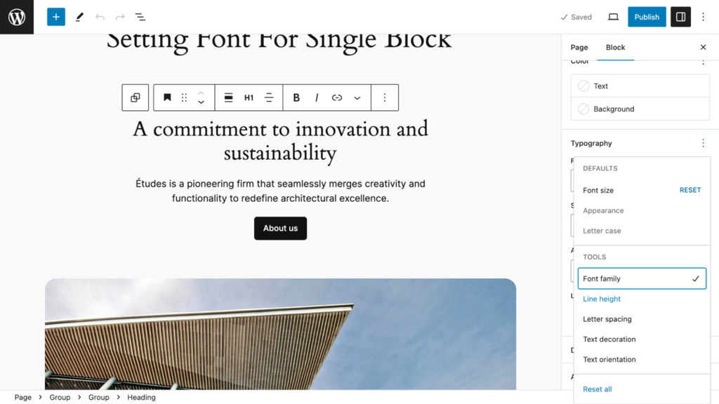
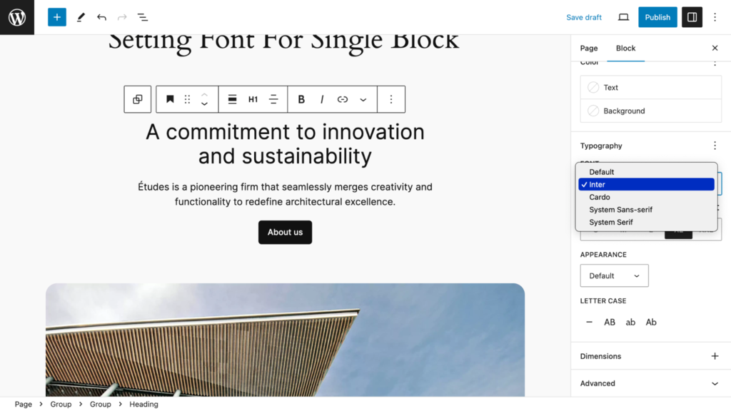
You can change a font for any single block to override Global Style settings. Here, the Heading is set to Cardo by default. To change it to Inter, click the three dots button next to Typography in the right sidebar to open a view that gives you the option to set the Font Family.
Then, click outside of the Typography window but inside the right sidebar (it’s tricky) to display font options. Here, I make the change to Inter.
Templates
The theme comes with these eleven templates from which any type of page can be built:
Templates for Blogging
- Singe Posts
- Blog Home
- * Post with Sidebar
Templates for Pages
- Pages
- * Page with Sidebar
- Page without Title
- * Page with Wide Image
Templates for Specialty Pages
- Index
- 404 Page
- Search Page
- Archive Page
(* = unique to TwentyTwenyFour)
Working With the Page With Wide Image Template
Here’s an example of how I used one of Twenty Twenty-Four’s unique templates to fashion two pages.
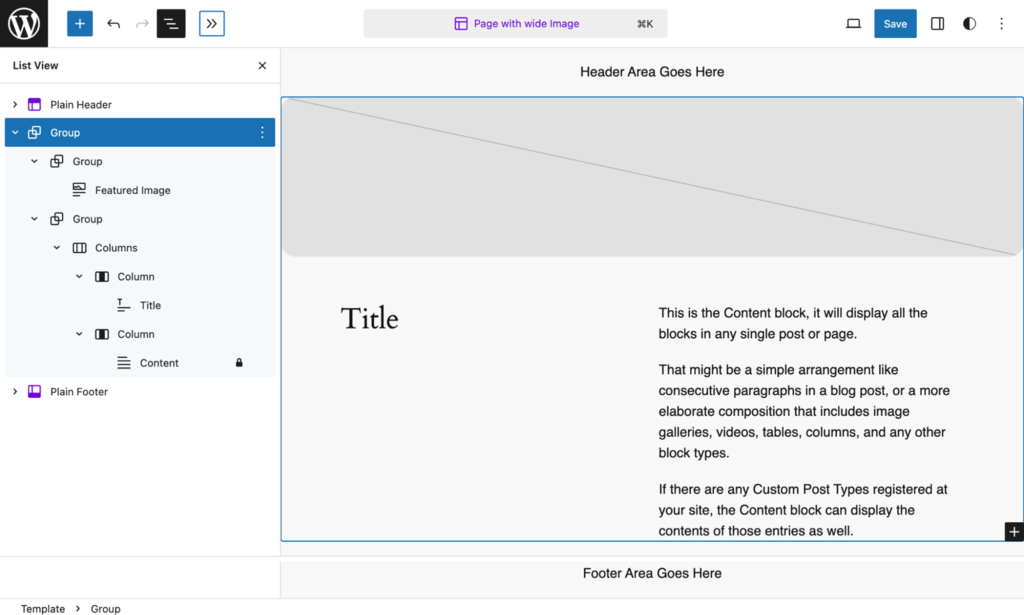
As I preferred to have the featured image stretch across the width of the screen, I changed the width from Normal To Full Screen. This was the only change I made to this template.
The essence of the template is a group block sandwiched between header and footer blocks. (For clarity, I removed the default header and footer blocks and replaced them with my placeholder blocks).
Within the group block are the featured image, title, and content block placeholders. These will be populated when I use the template in the two examples below.
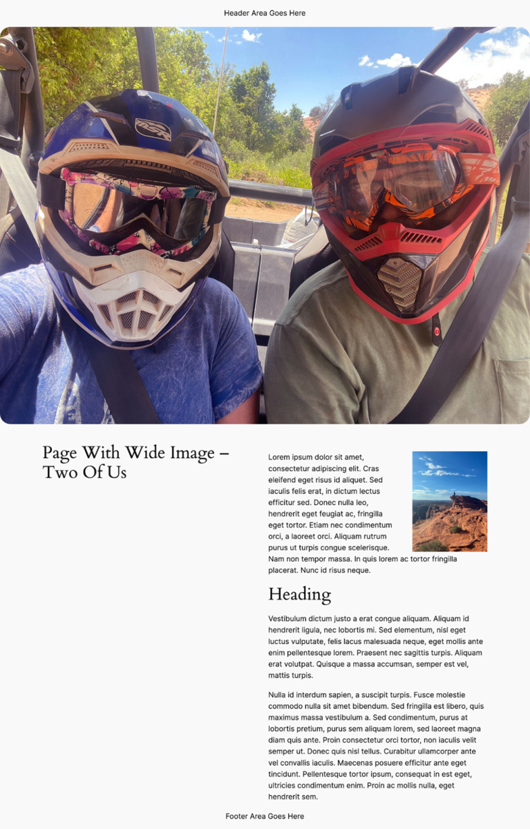
To use the template, I changed the default page template to Page With Wide Image and then added my feature image.
The result is this page.
Using the same template, I made this page.
What is the difference between a pattern and a template? Patterns are collections of pre-designed parts of pages that you can easily adapt for your use. Think of patterns as design starters. A template sets the layout of a given page. Any page you see on a WordPress site is set by a single template.
Patterns are used within a template to generate a web page.
3 Examples of Using Patterns to Build Custom Sites
In all three of the following examples, I chose the default style variation.
Using a Page Pattern to Build a Base Page for a Business
Most websites use a generic pattern that is repeatedly used for typical pages. A good way to start is by choosing a Page Pattern and then modifying it for a design that can be used throughout the site.
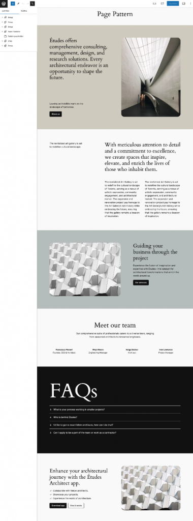
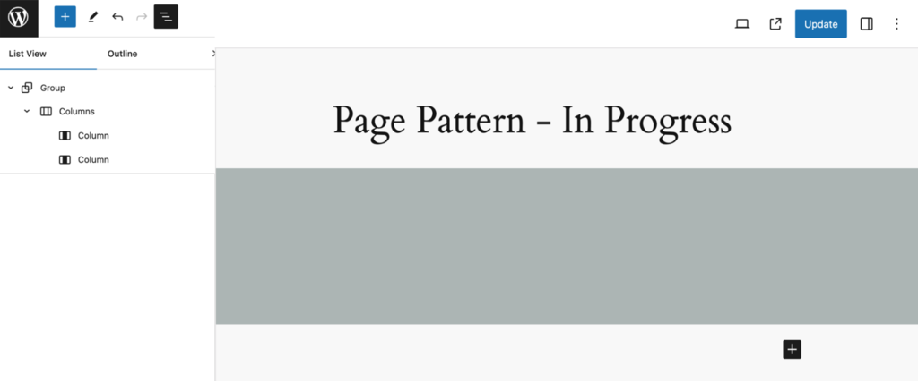
Here, I start with a Page pattern that I will use to build a business site. This pattern features six horizontal sections (Group blocks), some of which have two or more columns within a section.
This being a base (all-purpose) page by necessity, it needs to be barebones as it will be used for these interior pages and more:
- About, Services, Testimonial, Team, Landing, and Contact pages
- Search Results page
- 404 page
Here’s how I created this minimalist base pattern from which other blocks can be added as needed for different pages.
- Removed all horizontal (row) sections except for the third one. Then, I removed the two columns within, leaving me an empty, gray background group.
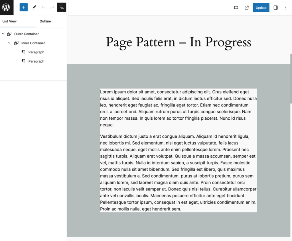
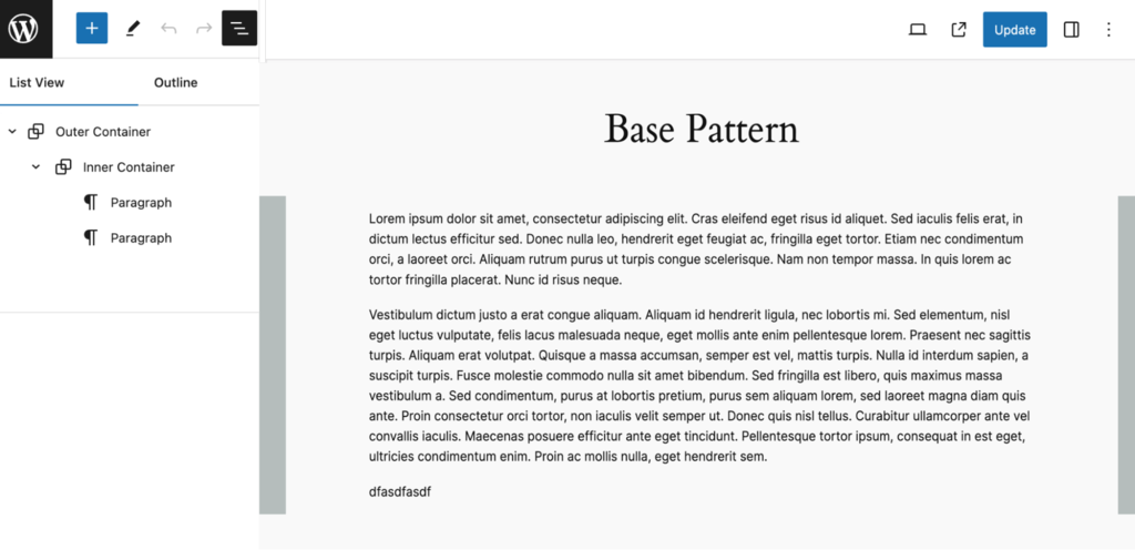
- I renamed the group Outer Container, added a group block within that, and renamed it Inner Container set to a white background. Inside that, I added two paragraphs of Lorem text as placeholders. Lastly, I removed the columns block as it was not needed.
- As for the widths and heights of the Containers, here are the important settings:
Because some of the settings of the outer and inner containers are not default, here they are:
Outer Container
- The inner container inherits the width of this container.
- The left and right padding slider is set to 3 positions from the left.
Inner Container
The left and right padding is set to 10%.
The result is this multi-purpose pattern that I renamed “Base Pattern”.
Could I have dispensed with creating this simple pattern from a more elaborate pattern and just started from scratch? Yes, so let’s look at this next and more challenging example where I used image placeholders to make a gallery pattern.
Using Placeholders to Build a Portfolio Site
One of the new features in WordPress 6.4 is the use of image placeholders, which fully utilize the ability to create patterns.
By design, Twenty Twenty-Four has seven image placeholder patterns onboard, but as you will see, you are not limited to those patterns.
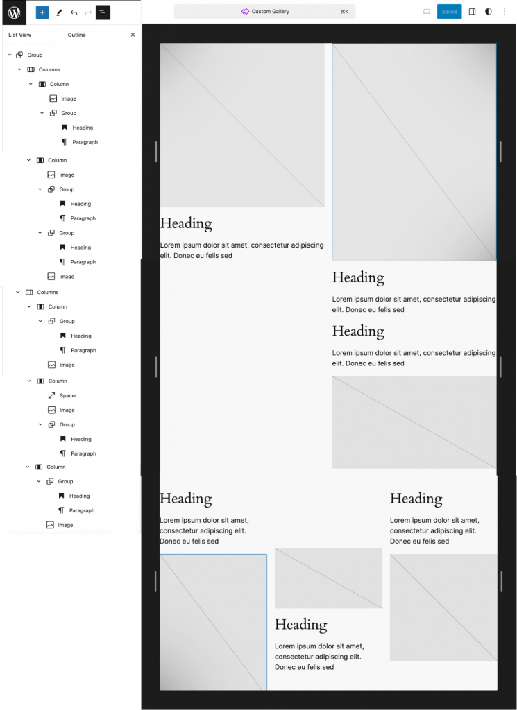
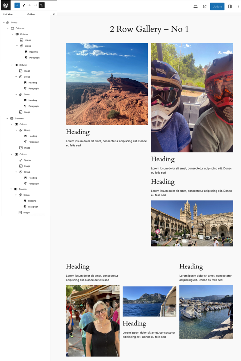
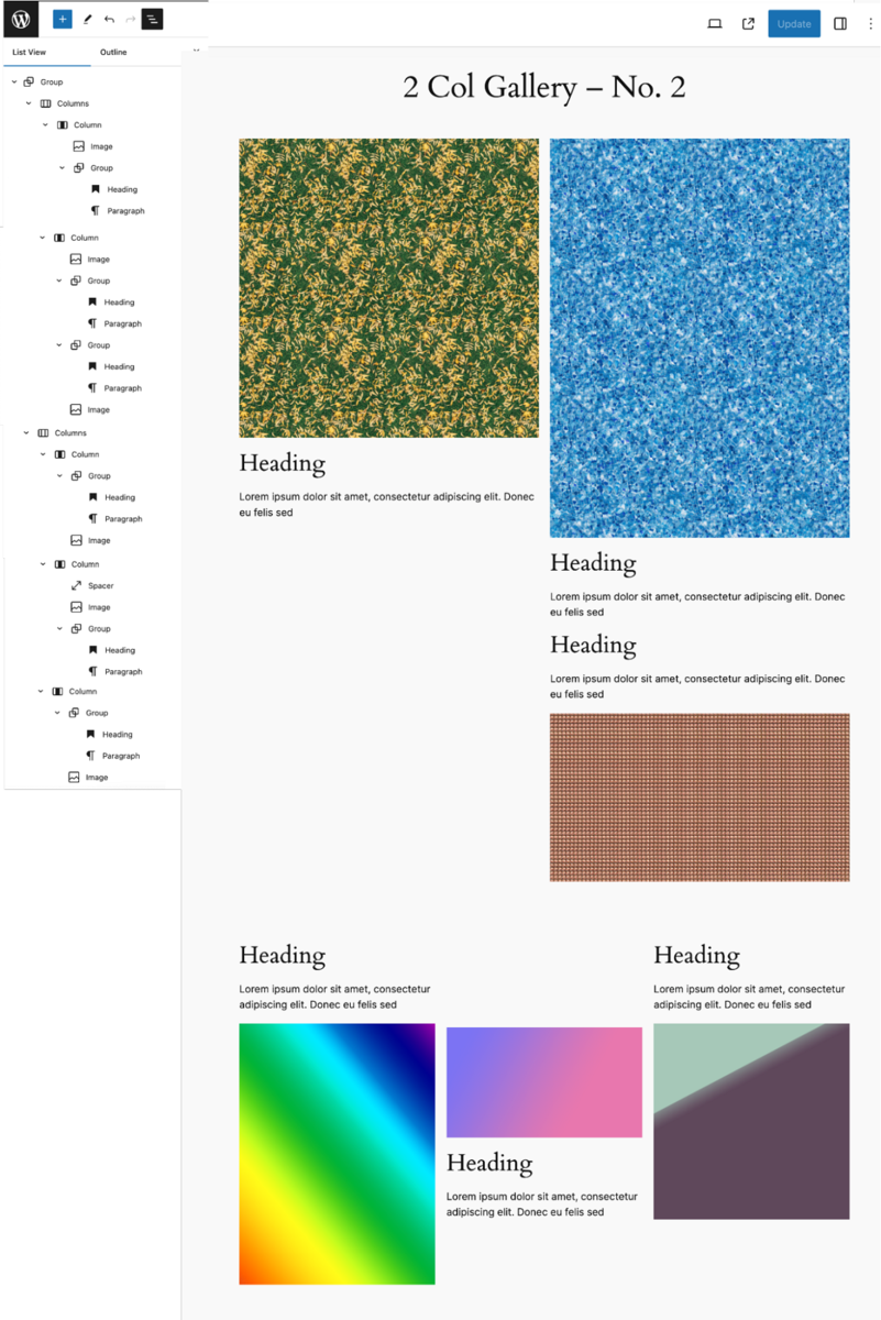
Here, I started from scratch using a blank page to build a Gallery Pattern that I can use anywhere on my site.
How is the placeholder created? Insert the image block where you plan on having an image, but don’t add the image like you normally would.
The diagonal lines represent where images can be placed; hence, those are the placeholders. I also added areas for text descriptions adjacent to each image.
In the image settings (right sidebar), you have these options to set the dimensions of an image.
- Original Size
- Square 1:1
- Standard 4:3
- Portrait 3:4
- Classic 3:2
- Classic Portrait 2:3
- Wide 16:9
- Tall 9:16
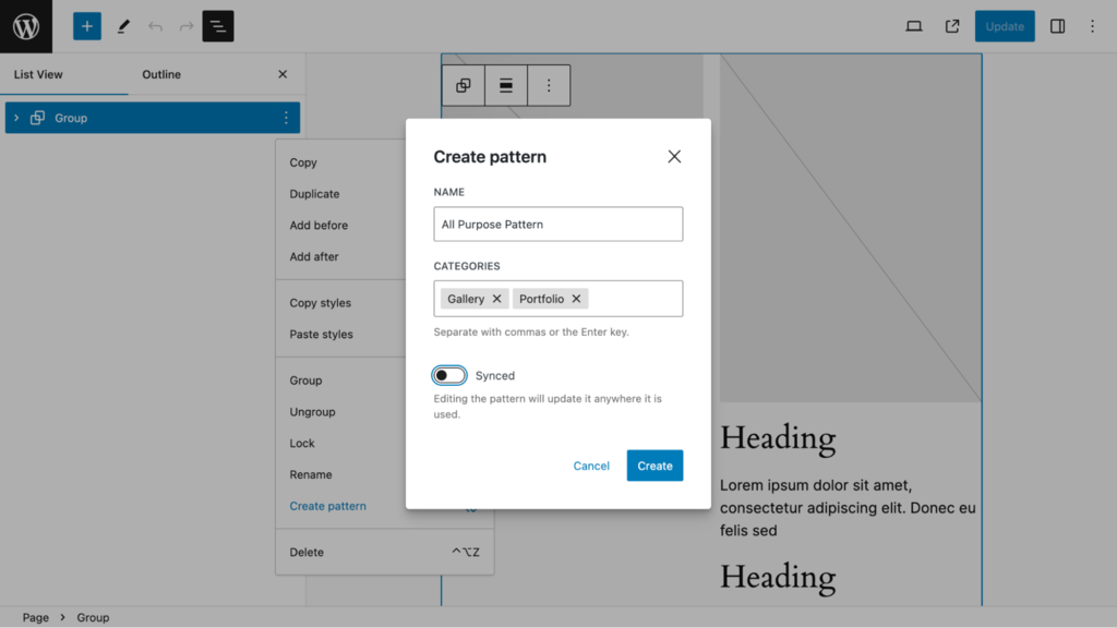
The most important setting is when you save the pattern. Here is the setting I used. Note that I used two categories where my pattern will be stored and that the Sync option is toggled off.
With my pattern saved, I then used it to build these two Gallery pages. In the Inserter, I selected Patterns and found my Pattern in the My Patterns Category as well as the Gallery and Portfolio categories.
Building a Blog Archive Pattern
Not surprisingly, Twenty Twenty-Four is ideally suited for bloggers. It comes with seven patterns that can be used for the blog home (archive page).
However, I chose to create a blog archive pattern that can be used anywhere as needed.
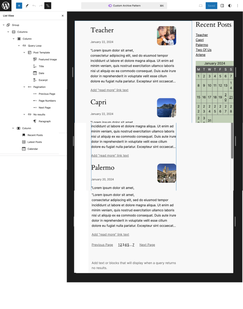
I started from scratch in the Site Editor and created a two-column layout wrapped inside a group block. The left column contains the all-important query look block, pulling in dynamic content depending on how the pattern is used.
I arranged the dynamic elements of the loop (Title, Featured Image, Date, Excerpt, and Pagination as desired). The right column includes three blocks, two of which display dyadic content (Recent Posts and Calendar).
Here is the Archive Pattern.
Like in the previous Gallery pattern, I saved my pattern without syncing. So, I won’t alter the original master pattern whenever I use it.
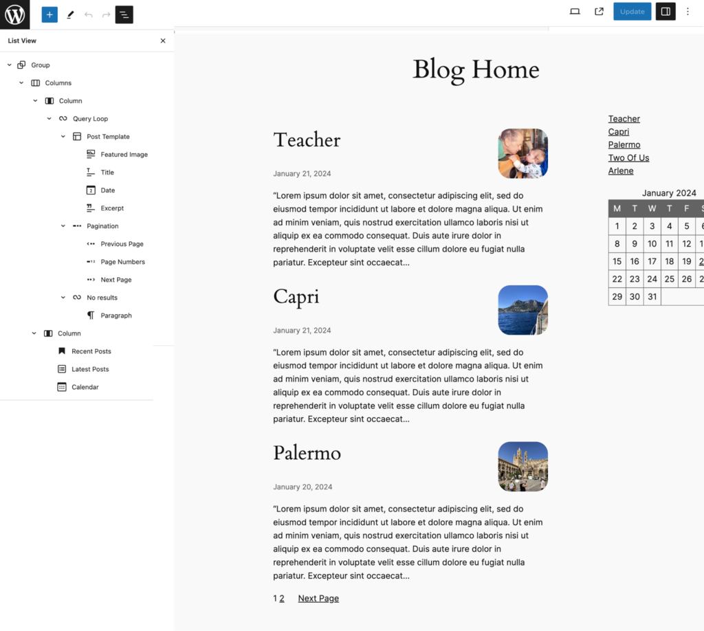
Using the pattern, I made this very clean and elegant blog home page.
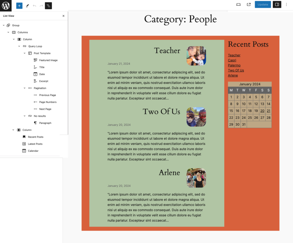
The second time I used this pattern was for a Category Archive page that displays only posts with the “People” Category.
Here, I made just a few adjustments to my design using my Archive Pattern.
When you have a design that repeats throughout your site, patterns will save you a lot of time and be fun to build.

Conclusion
Twenty Twenty-Four is a fun and flexible theme that was introduced with WordPress 6.4. While its core strength is for business, portfolio, and blogging sites, it can be used for any website.
You don’t need to use a block theme such as Twenty Twenty-Four to make patterns. For my three examples, the gallery and archive patterns were made within the Site Editor. For the basic page pattern, I used the Page Editor.
In that case, I used the three dots option in the Inserter like this:
